top of page
Restart C.B.D.
Label Design
RESTART CBD is an education first CBD wellness brand. They have tasked me with redesigning the labels of some of their products. This initiative aims to improve the overall appearance and functionality of the labels to enhance user convenience and satisfaction.
CONCEPT 1
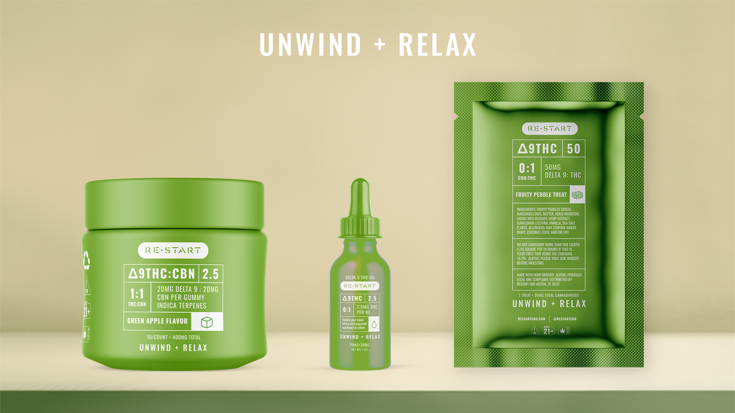
I have chosen to go bold with colors, and imagine that the color of the product coincides with the product qualities; red for Energy + Focus, purple for Rest + Sleep, and green for Relax + Unwind. I wanted to highlight the medicinal qualities of the products, I took inspiration from medical labels for the ingredients and milligrams. To make it easy to understand what's inside the products, I created icons for them. To expand this idea, we could use different brand colors for other themes of products. This will not only make the products stand out and be aesthetically pleasing, but will make it easier for the customer to find the products that they might be interested in.


CONCEPT 2
For this concept, I aimed to emphasize the transparency of your product by utilizing minimalist illustrations on the packaging to depict the contents of each product. This concept can easily flex to other colors and already fits within your color palette.

bottom of page
